Visualizing Corporate Plunder of the Canada Emergency Wage Subsidy with Bullet Charts
DS4CS Learning: Make more impactful comparisons with bullet charts using R and ggplot2

In the first post in the DS4CS Learning Series, I shared the code used to produce my first story on the Canada Emergency Wage Subsidy, which was a corporate feeding frenzy of historical proportions. In this post, I’ll be demonstrating how to produce the visuals for the CEWS story using ggplot2, focusing on bullet charts. Along the way, I’ll also share a few tips for working much more efficiently with R, including iteration with map and how to automate chart production with custom functions.
If you would like to recreate the charts exactly as they are, you can either visit the first post and follow along or download the archive of .rds files used to make the charts right here. If you are just here for the functions used to produce the bullet charts in the article, feel free to download the R script here.
Table of Contents
Hold on! What’s a bullet chart?
A bullet chart is an upgraded bar-within-bar version of a bar chart created by data visualization and dashboard expert Stephen Few. Bullet charts are an appropriate upgrade to a bar chart in cases that require making a comparison between two quantitative variables, often as they relate to a third grouping variable. What sets a bullet chart apart from a conventional bar chart?
First, bullet charts have a much higher information density compared to a similar grouped bar chart. An additional layer of quantitative data is imposed over the data represented in the bar, with the possibility to encode even more information by adding a benchmark tick and filling of the bars based on a qualitative measure.

Comparison of two quantitative variables across a third grouping variable is exactly what was needed to visualize the corporate free-for-all that was the Canada Emergency Wage Subsidy. In this case, we want to compare two quantitative variables, net corporate profits and the amount of CEWS received, across a third categorical variable denoting each industry.
From Data Viz to Data Storytelling
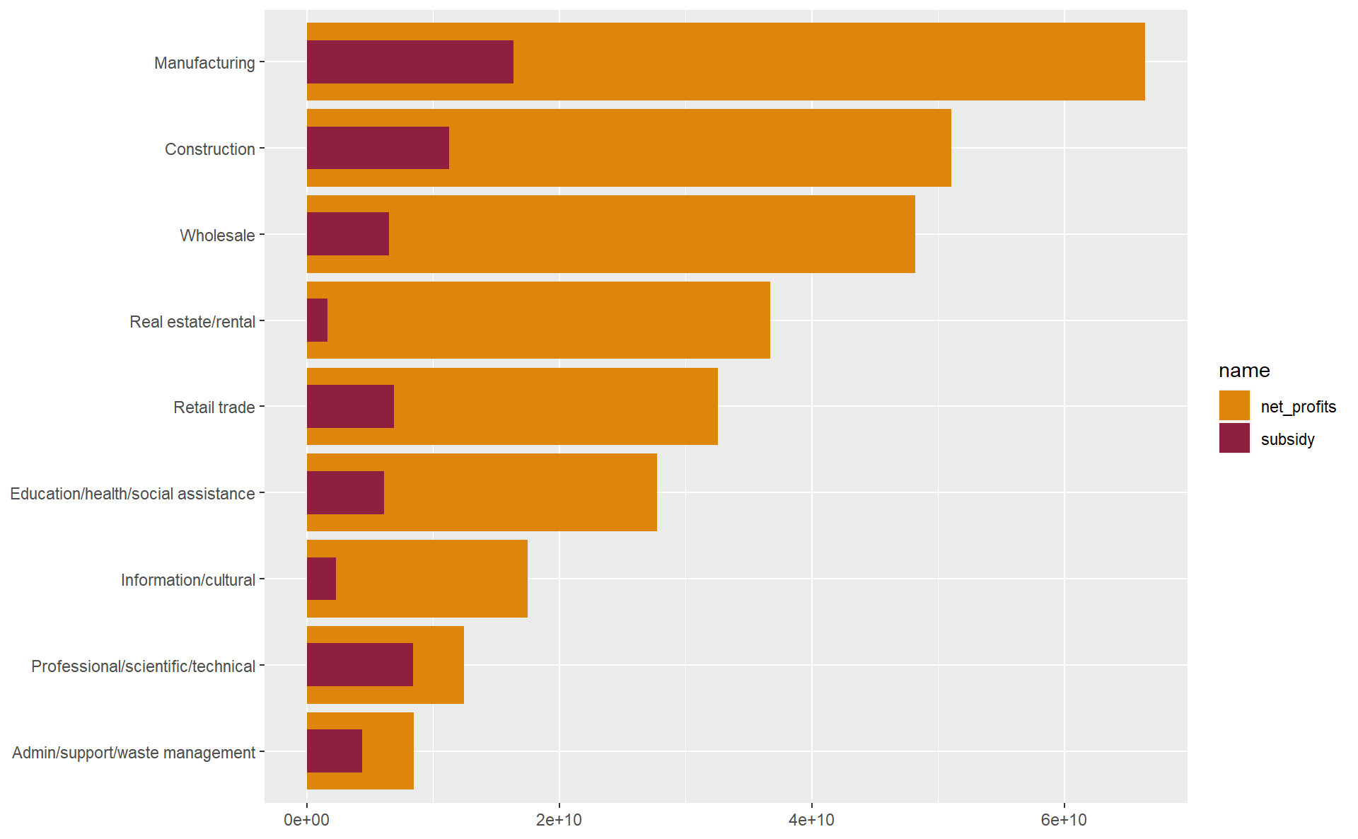
It would be entirely possible and valid —also likely the default in many programs like Excel— to visualize this data as a grouped bar chart like below, with the yellow bars denoting net_profits and the red bars representing the subsidy received by the industry. It gets the basic message across, most industries took in billions of subsidies while raking in greatly more in net profit. But it isn’t a particularly high impact visualization in any regard.

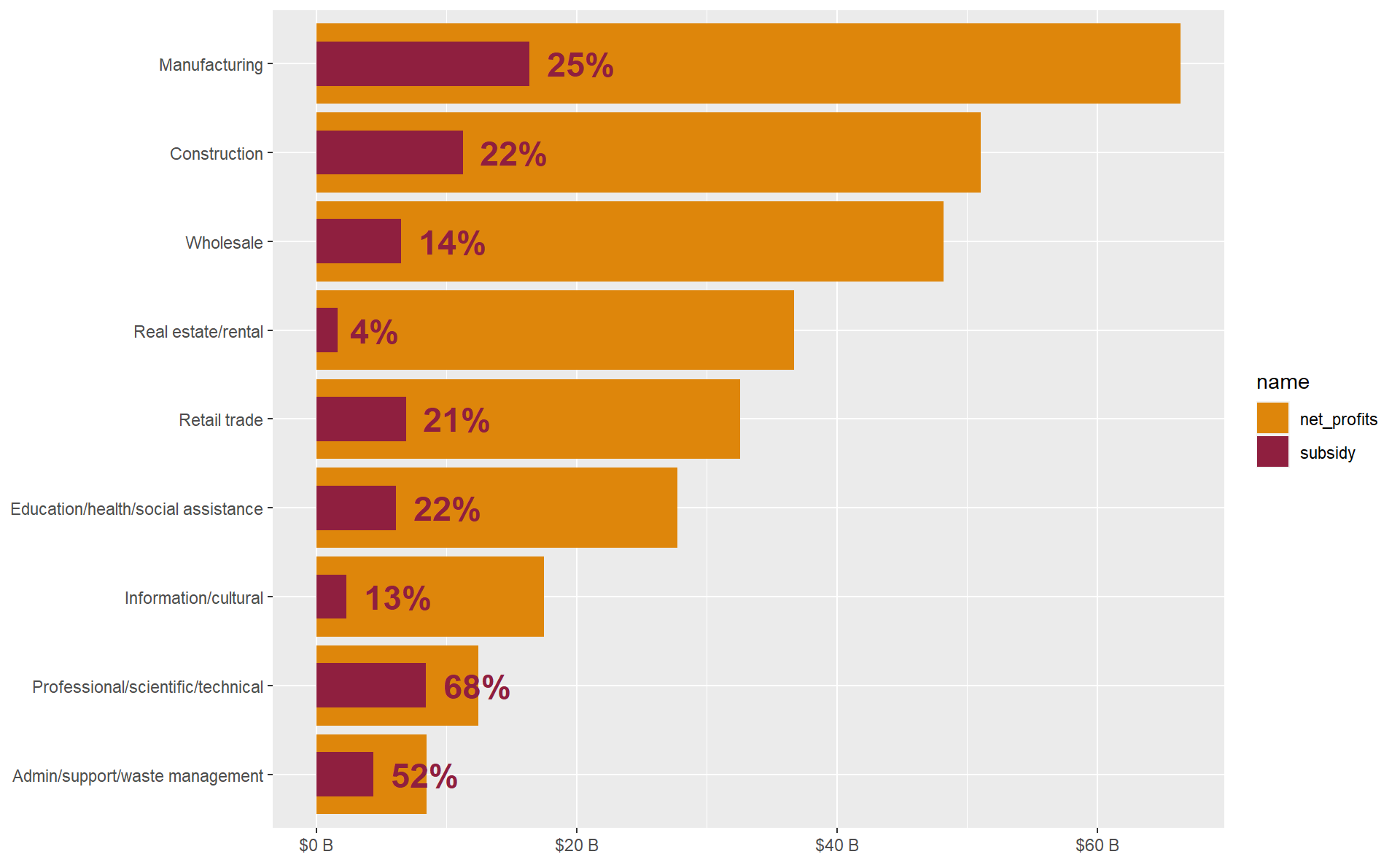
Visualizing the same data as a bullet chart is much a more effective way of making this comparison. First, the subtle change in the visual layering of the data anchors the second comparison variable into the middle of the bar of the first. This immediately signals visual comparison to the viewer’s eye.
The visual layering and bar-width difference can be used to highlight the subordinate or hierarchical nature of many comparisons, which is in this instance that subsidy will always be less than net_profits for this particular chart. Look up at the bar chart and notice that the identical width and visual weight of the bars. The bullet chart on the other hand, assigns far greater visual weight to the bar representing profits. The inner bar representing state subsidies forms the visual foundation of the thick bar representing capitalist profits. In such ways the bullet chart conveys visually the true story that profit is the priority in the capitalist response to the COVID crisis.

Also, the bullet chart format allows for adding value labels denoting the inner bar as a percentage of the outer bar. Viewing a grouped bar chart, we’re often trying to make this calculation in our mind: “This bar is what percentage of that bar?" In a bullet chart, the layering of bars and the way the inner bar anchors the bar base already prime the viewer’s eye to to see it. This kind of labeling is intuitive for a bullet bar, but would be difficult to pull off in a conventional grouped bar chart.
Retrieving and preparing the data
Using map and anonymous functions for iteration in efficient data science workflows
First, start as most data science workflows do, by loading the packages that you need before most of your other code. It’s a good practice to load all of the packages up-front, so that they can be shared in a list of package dependencies if you want others to be able to reproduce your code.
pacman::p_load(tidyverse, here, hrbrthemes, ggtext, showtext, ragg)
One of the great things about switching from ‘point and click’ workflows in software like Excel to a functional scripting language like R is the potential to greatly boost the efficiency and effectiveness of your work, while reducing the burden of overly tedious, yet common data science tasks. Don’t repeat yourself is a basic principle of good coding. If a piece of code is going to be replicated more than a few times, it’s almost always a better choice to use functions and/or iteration. It will not only save you time and effort via automation, but also many headaches down the road, since more concise code is much less likely to break and easier to debug when it does.
Iteration is an incredibly common and useful task in coding and data science. In this context, iteration simply means a set of instructions (e.g., function call, operations) that repeats in sequence. Using R, it’s possible to iterate over just about any object including vectors, lists, environment variables, data frame columns and rows, charts and graphs, file paths, URLs, you name it.
Here is a simple example of DRY in action, using the map function from the absolutely essential purrr package. The map function takes any vector or list as it’s first argument .x and the second argument .f is a function call that iterates over each item in .x. Rather than type out the call to read_rds and here with the full file path three times, we can use an anonymous function within map to paste a vector of strings cews_paths into file paths in order to import all three tables in one call. An anonymous function can be defined on-the-fly without having to assign it to an object in the environment. If the concept of an anonymous function is new to you, it’s worth reading a short introduction here.
cews_paths <- c("cews_profits.rds", "cews_size.rds", "lobby_full.rds")

cews_data <- map(.x = cews_paths,
                 .f =  ~ read_rds(here('ds4cs_working', 'posts', 'l1_cews_lesson', 'data', paste(.x))))
purrr has a special shorthand syntax ~ that makes using anonymous functions within calls to map even easier and more concise. Place the ~ immediately preceding the function call .f in map and use .x to control where in the function the items you wish to iterate over will be placed. If this returns an error object .x not found, you’ve likely forgotten to use ~ to tell R that this is an anonymous function, so it’s looking for an actual object named .x and not iterating through the items supplied to .x.
Working with lists in R
By default, map will return the output of the supplied function as a list with one element for each iteration over .x. In this instance, one tibble for each file path.
class(cews_data)
## [1] "list"
Working with lists can be tricky at first, but it is worth getting used to for the incredible benefits to one’s workflow it will unlock down the road. Using purrr:set_names, each tibble in the list is assigned a name, making the list a bit easier to work with.
cews_data <- cews_data %>%
  set_names(nm = c("profits", "size", "lobby"))

cews_data
## $profits
## # A tibble: 13 x 4
##    naics_final                           net_profits     subsidy pct_profits
##    <fct>                                       <dbl>       <dbl>       <dbl>
##  1 Manufacturing                         66407000000 16398789000     0.247
##  2 Construction                          51026000000 11274636000     0.221
##  3 Arts/Acc/Food/Ent/Rec                 -5013000000 10584779000    -2.11
##  4 Professional/scientific/technical     12444000000  8440205000     0.678
##  5 Retail trade                          32556000000  6898995000     0.212
##  6 Wholesale                             48206000000  6524043000     0.135
##  7 Education/health/social assistance    27736000000  6156076000     0.222
##  8 Transportation/warehousing             5306000000  5933819000     1.12
##  9 Admin/support/waste management         8466000000  4412868000     0.521
## 10 Information/cultural                  17490000000  2346207000     0.134
## 11 Real estate/rental                    36691000000  1633529000     0.0445
## 12 Agriculture/forestry/fishery/hunting   6652000000  1462767000     0.220
## 13 Utilities                            -20878000000    52907000    -0.00253
##
## $size
## # A tibble: 3 x 6
##   claim_period size_of_applicant applications subsidy pct_total pct_total_subsi~
##   <chr>        <chr>                    <dbl>   <dbl>     <dbl>            <dbl>
## 1 All Periods  Small (25 or few~      3352710 2.37e10     0.776            0.256
## 2 All Periods  Medium (26 to 25~       901540 3.88e10     0.209            0.419
## 3 All Periods  Large (over 250 ~        56920 3.01e10     0.013            0.325
##
## $lobby
## # A tibble: 50 x 6
##        id ref_date   corp                   ref_year source              subsidy
##     <dbl> <date>     <chr>                     <dbl> <chr>                 <dbl>
##  1 914017 2021-07-15 Air Canada                 2021 Canada Revenue Ag~   5.86e8
##  2 911084 2021-04-15 Suncor Energy Inc.         2021 Canada Revenue Ag~   3.58e8
##  3 911062 2021-08-09 Magna International I~     2021 Canada Revenue Ag~   2.37e8
##  4 908834 2021-02-16 Canadian Natural Reso~     2021 Canada Revenue Ag~   1.93e8
##  5 909811 2021-03-15 Imperial Oil Limited       2021 Canada Revenue Ag~   1.56e8
##  6 908767 2021-02-15 Fca Canada Inc.            2021 Canada Revenue Ag~   1.41e8
##  7 912222 2021-06-02 Bce Inc.                   2021 Canada Revenue Ag~   1.23e8
##  8 913181 2021-06-15 Transat A.t. Inc.          2021 Canada Revenue Ag~   1.14e8
##  9 913576 2021-07-06 Honda Canada Inc.          2021 Canada Revenue Ag~   9.32e7
## 10 908296 2021-02-02 Ford Motor Company Of~     2021 Canada Revenue Ag~   8.70e7
## # ... with 40 more rows
Once the data is imported, some quick last minute adjustments are made to prepare the data for plotting. One way to work with lists is using the subset operator $ to access list items by name. In the profits tibble, unprofitable industries are filtered out (though they could be included in the chart with some additional effort) and set the factor levels in descending order of net_profits. We do the latter because when using ggplot2 to plot a factor, the levels will be the default plotting order of the items.
filter_industries <- c('Transportation/warehousing', 'Utilities', 'Agriculture/forestry/fishery/hunting', 'Arts/Acc/Food/Ent/Rec')

cews_data$profits <-  cews_data$profits %>%
  filter(!naics_final %in% filter_industries) %>%
  mutate(naics_final = fct_reorder(naics_final, net_profits))
List items can also be accessed by numerical index list[[n]] as well, as is done to take the top 15 biggest CEWS recipients from the lobby tibble below.
cews_data[[3]] <- cews_data[[3]] %>%
  slice_max(subsidy, n = 15)
Masterful crafting of bullet charts with ggplot2
Essential data structure for a bullet chart
The basic data structure required to produce a bullet chart with ggplot2 is as follows:
- Data must be in the form of a data frame or tibble
- Categorical variable
xthat form the axis categories - Categorical variable
zwith labels for the two quantitative variables - Numerical variable
ywith values linked toxandz - Width column, denoting the variable widths of the bullet chart bars.
See a bare bones example of the data created from scratch with the tibble::tribble function, which can be pretty useful when you need to come up with small amounts of hand crafted data in a hurry.
# Calculate the sum of the net profits column
profit_total <- cews_data$profits %>% .$net_profits %>% sum()
# Final total subsidy amount taken from CRA website
cews_total <- 92794229000

cews_vs_profits_total <- tribble(
  ~ x, ~ z, ~ y, ~width,
  "Total, all industries", "profits", profit_total, 0.7,
  "Total, all industries", "subsidy", cews_total, 0.3
)

cews_vs_profits_total
## # A tibble: 2 x 4
##   x                     z                  y width
##   <chr>                 <chr>          <dbl> <dbl>
## 1 Total, all industries profits 301022000000   0.7
## 2 Total, all industries subsidy  92794229000   0.3
Using the grammar of graphics to build a basic bullet chart
If you are first approaching ggplot2, I’d highly recommend familiarizing yourself with the grammar of graphics, a design philosophy that breaks down visualizations into combinations of layers, mappings, scales, coordinated, and facets. Plot components can be added together one at a time with the + operator, always starting with an initial call to the ggplot() function.
The variables that you want to map to aesthetic outputs to make charts need to be passed to the aes() function within the call to ggplot(). Once the aesthetics are mapped with aes, shapes are added to the plot using geom_ functions, in this case, adding bars with geom_col() and grabbing the bar widths from the original tibble with $width.
The plot’s coordinate system can be changed with the coord_ functions. The type of plot produced will vary according to different combinations of geometry and coordinates. After adding bars to the chart, change the coordinates to turn it into a horizontal bar chart with coord_flip(). There’s no limit to the number of geoms that a ggplot can have, as long as they map to your data in valid ways, but a chart can (usually) only accommodate one coordinate system.
covid_profit_bars_total <- cews_vs_profits_total %>%
  ggplot(aes(x, y, fill = z)) +
  geom_col(width = cews_vs_profits_total$width) +
  coord_flip()

covid_profit_bars_total
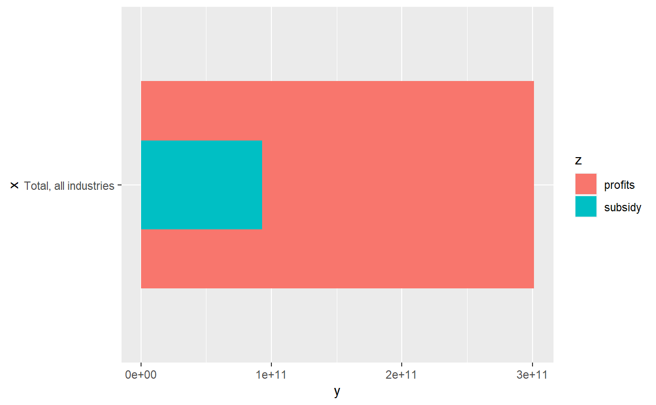
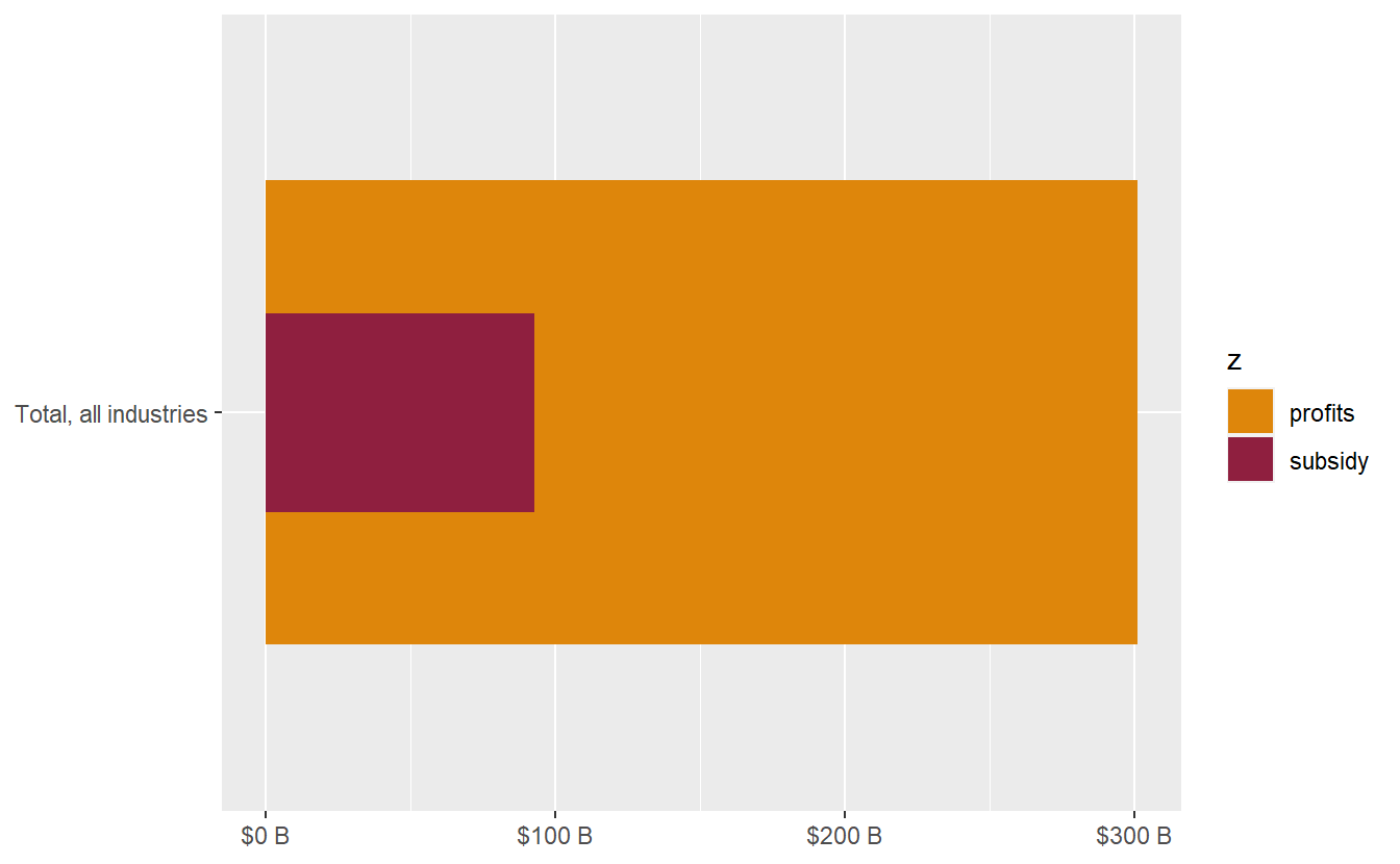
The default chart output without any changes to styling and scales is usually not going to look great. Axis scales and scales mapped to aesthetic variables (e.g. color, fill, size, transparency) can be added and adjusted with the scale_ functions all types. Now we can add custom fill colours with scale_fill_manual and adjust units of the axis scale labels with scale_y_continuous. It’s looking a bit better already.
covid_profit_bars_total <- covid_profit_bars_total +
  scale_fill_manual(values = c("#de860b", "#8f1f3f")) +
  scale_y_continuous(labels = scales::unit_format(unit = "B", prefix = "$", scale = 10^-9)) +
  labs(y = NULL, x = NULL)

covid_profit_bars_total
Adding value labels to bullet bar charts
Value labels can be added to bar charts by using geom_text and passing the numeric values to the label aesthetic. For these bullet charts, we want to add a value label showing the inner bar as a percentage of the outer bar. By default, geom_text is going to insert value labels for each series, but we only want to display a single label for the inner bar. It’s often the case when making bar charts to want to add value labels only to certain bars, which can be accomplished by changing the data argument of the call to geom_text and filtering the data frame for only the values to be plotted as labels.
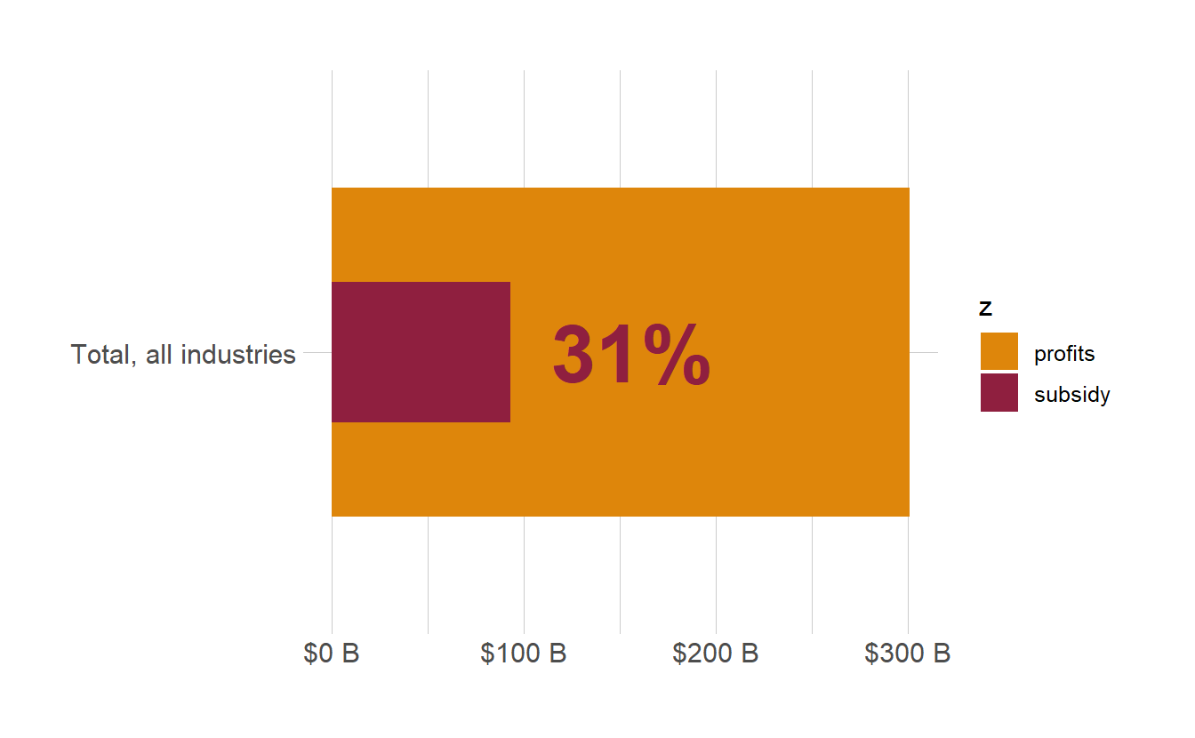
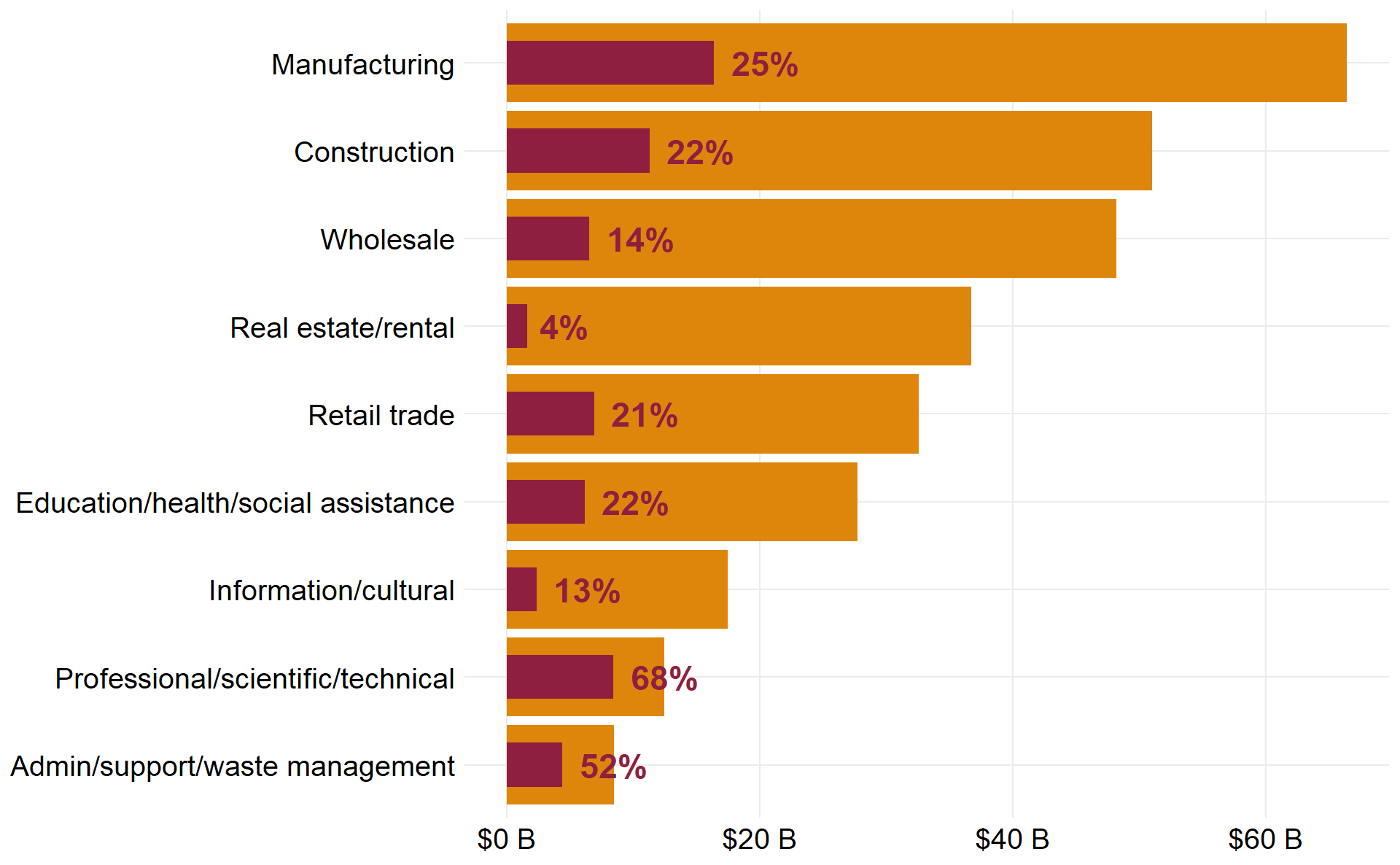
Quickly improve the look of the chart by applying a theme_ function from the hrbrthemes package. We have ourselves a basic bullet chart. In total, Canadian corporations raked in over $300 billion in profits from 2020 to the third quarter of 2021, while taking in just under a third of that total overall in CEWS.
covid_profit_bars_total <- covid_profit_bars_total +
  geom_text(
    data = cews_vs_profits_total %>%
      filter(z == "subsidy"),
    aes(label = scales::percent(cews_total/profit_total, accuracy = 1L)),
    hjust = -0.25, fontface = 'bold', color = "#8f1f3f", size = 12)

covid_profit_bars_total +
  hrbrthemes::theme_ipsum() +
  theme(panel.grid = element_blank())
The joy of chart production using functional programming
So you now know how to make a bullet chart from scratch. But what if you had to create a bullet chart for every single pair of variables in a report? Are you going to have to copy and paste the code for each chart? No sweat, avoid wasting time with duplication by writing a function to automate the task.
As a functional programming language, functions are the star of the show in R. A custom function can be defined by assigning a call to function (itself a function) to an object in an environment with the <- operator.
Below, I have defined a function that takes a data frame as input, transposes the comparison column to long form with pivot_longer and inserts the bar widths by group with mutate and rep. From there, the function automatically produces a basic bullet bar chart by placing the input captured by the dots ... in the third argument, which take an arbitrary number of inputs, into the aesthetic mappings of ggplot2 through aes.
ds4cs_bullet_chart <- function(df,
                               pivot_by,
                               ...,
                               widths = c(.9, .5)) {

  df <- df %>%
    pivot_longer(cols = all_of(pivot_by)) %>%
    mutate(width = rep(widths, nrow(df)))

  ggplot(data = df, aes(...)) +
    geom_col(width = df$width) +
    coord_flip() +
    scale_fill_manual(values = c("#de860b", "#8f1f3f")) +
    labs(x = NULL, y = NULL)
}
When writing the call to function, you can specify the arguments that the function will take as inputs. Here is how the bullet chart function can be called with the chosen arguments:
dftakes a data frame or tibblepivot_bydenotes columns by numerical index to pivot into a longer into a single column for comparison...takes comma separated variable names as inputs toaesto create the chartwidthscontrols the width of the outer and inner bars respectively. This is an optional argument, since they it been given a default value.
covid_profit_bars <- ds4cs_bullet_chart(
    df = cews_data$profits,
    pivot_by = 2:3,
    x = naics_final, y = value, fill = name)

covid_profit_bars
Using tidy evaluation and custom functions with ggplot2
Let’s pair the bullet chart function with another function to automate adding the value labels with geom_text.
First, a brief note on using packages from the indispensable tidyverse (including ggplot2) within your own custom functions. For myself, understanding how R evaluates arguments to functions, and then how to make this work in the tidyverse was a major hurdle to clear in learning how to write and use functions. It you’re new to functional programming with R and the tidyverse, it’s worth reading on tidy evaluation in greater detail.
In base R, it’s necessary to use df$var or df["var"] to refer to a column of a data frame. This gets tedious and messy really quick. In the tidyverse, thanks to data masking, we can just directly use variables names without having to subset the data frame with $ or [ every time. To use bare variable names as inputs in custom functions, we have to first quote the input with enquo and then unquote it to use it in the body of the function with the unquote !! operator.
From there, the input to filter_var, also an unquoted variable name, is converted to a string to feed into filter using deparse and substitute. The original data used to recreate the plot can be retrieved from any ggplot object by accessing ggplot$data, so we grab the original data for filtering from the original chart passed to plot.
ds4cs_bullet_text <- function(plot, filter_var, label_var, text_size = 6) {

  filter_var <- deparse(substitute(filter_var))
  label_var <- enquo(label_var)

  df <- plot$data

  plot +
    geom_text(
      data = df %>% filter(name == filter_var),
      aes(label = scales::percent(!!label_var, accuracy = 1L)),
    hjust = -0.25, fontface = 'bold', color = "#8f1f3f", size = text_size)
}

covid_profit_bars <- covid_profit_bars %>%
  ds4cs_bullet_text(subsidy, pct_profits) +
  scale_y_continuous(labels = scales::unit_format(unit = "B", prefix = "$", scale = 10^-9))

covid_profit_bars
Put the icing on the cake with your own theme function
ggplot2 offers an incredible level of customization and control over the thematic elements of a plot through the theme function, which can control over 100 different plot elements. Use theme to apply the finishing touches by controlling elements like the horizontal or vertical axis, labels, grids, legends, margins, and much more. It’s also possible to use a function to store and efficiently apply a custom ggplot theme, like below.
theme_custom <- function(base_size = 18,
                         legend = 'none') {
  theme_minimal() %+replace%
    theme(
      text = element_text(size = base_size),
      axis.text = element_text(size = base_size - 1.5),
      panel.grid.minor = element_blank(),
      legend.position = legend
    )
}

covid_profit_bars + theme_custom(base_size = 16)
Adding it all together now
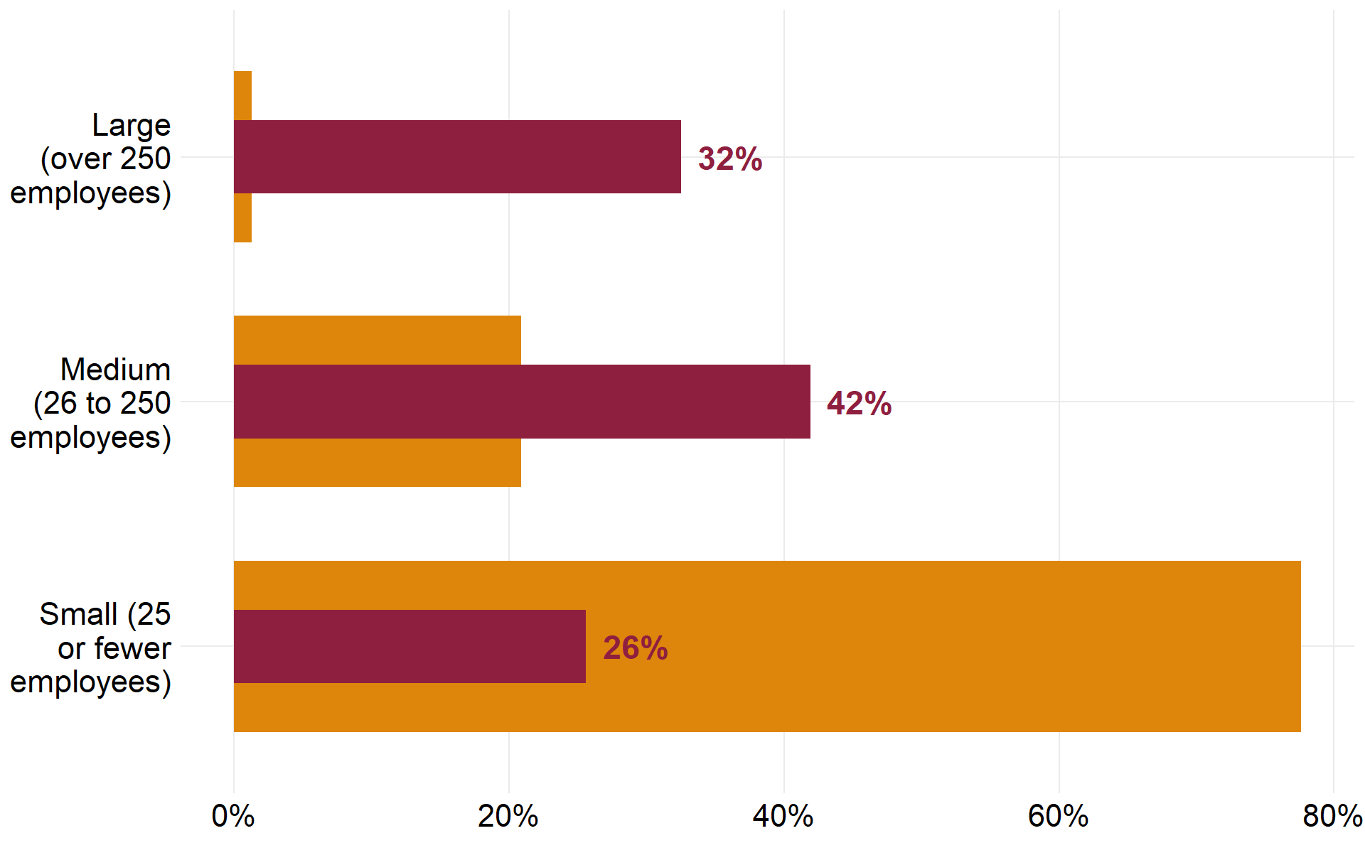
Here we’ll string all three function calls, together with pipes %>% in order to produce a bullet chart with a different kind of quantitative data, comparing the percent of CEWS received in red versus the percent of total CEWS applications in yellow by enterprise size. To finish, convert the horizontal axis to percent format and use an anonymous function (the ~ won’t work outside of purrr functions) to wrap the long text labels.
covid_size_bars <- ds4cs_bullet_chart(
    df = cews_data$size,
    pivot_by = 5:6,
    x = fct_rev(size_of_applicant), y = value, fill = name,
    widths = c(.7, .3)) %>%
  ds4cs_bullet_text(pct_total_subsidy, value) +
  theme_custom()

covid_size_bars +
  scale_x_discrete(labels = function(x) str_wrap(x, width = 12)) +
  scale_y_continuous(labels = scales::percent)
BONUS CHART and ditching legends for fancy text in plot titles and subtitles
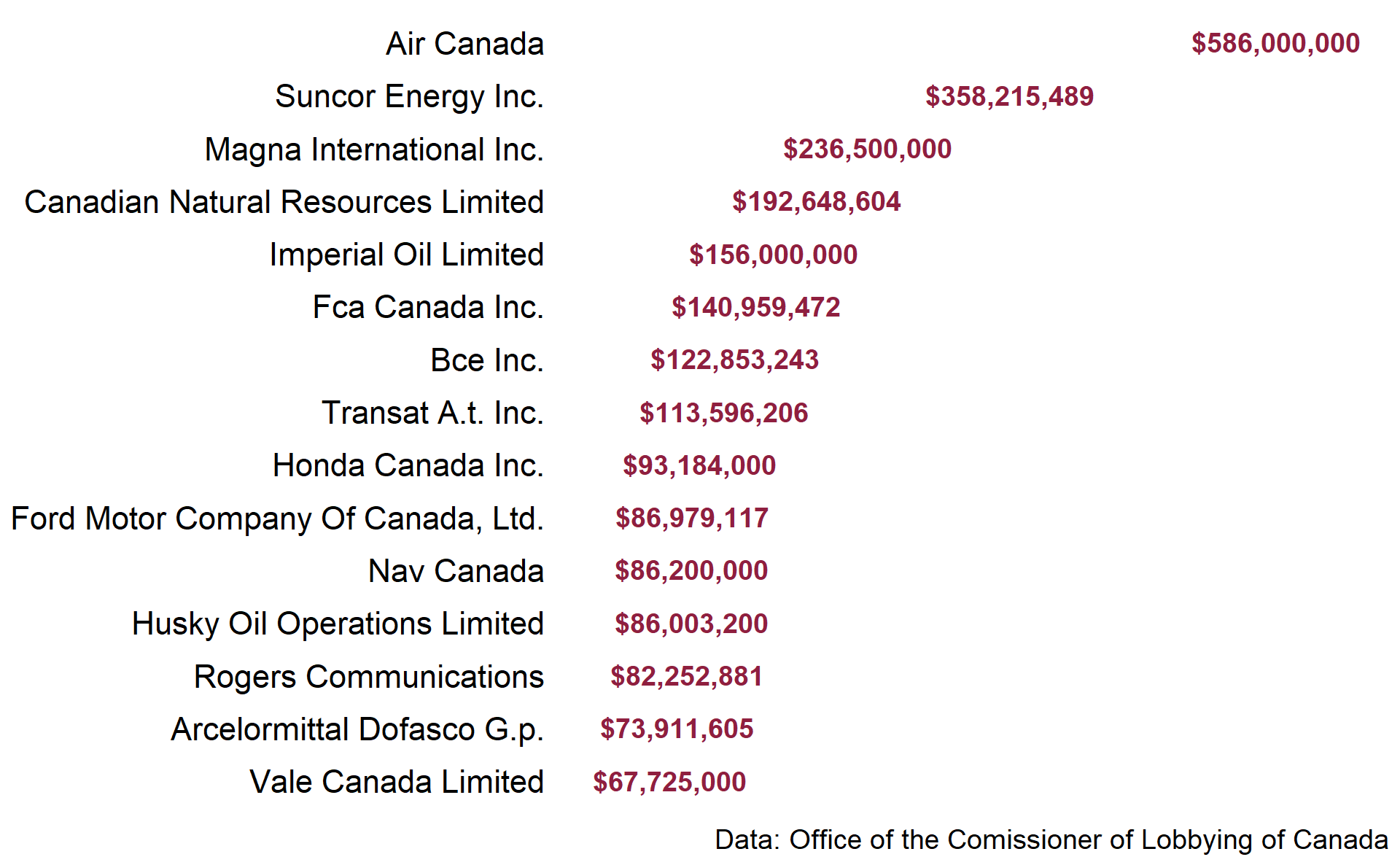
But wait! There’s still one more chart to go; this one is nothing like a bullet chart, so we’ll call it a bonus chart. I haven’t really seen anyone use a chart like this before, so I’m not sure what to call it. Text-as-the-bar bar chart perhaps? The data format for this chart is identical to a regular bar chart, but instead of adding bars with geom_col or geom_bar, use geom_text to paste the values labels directly where the bars should be.
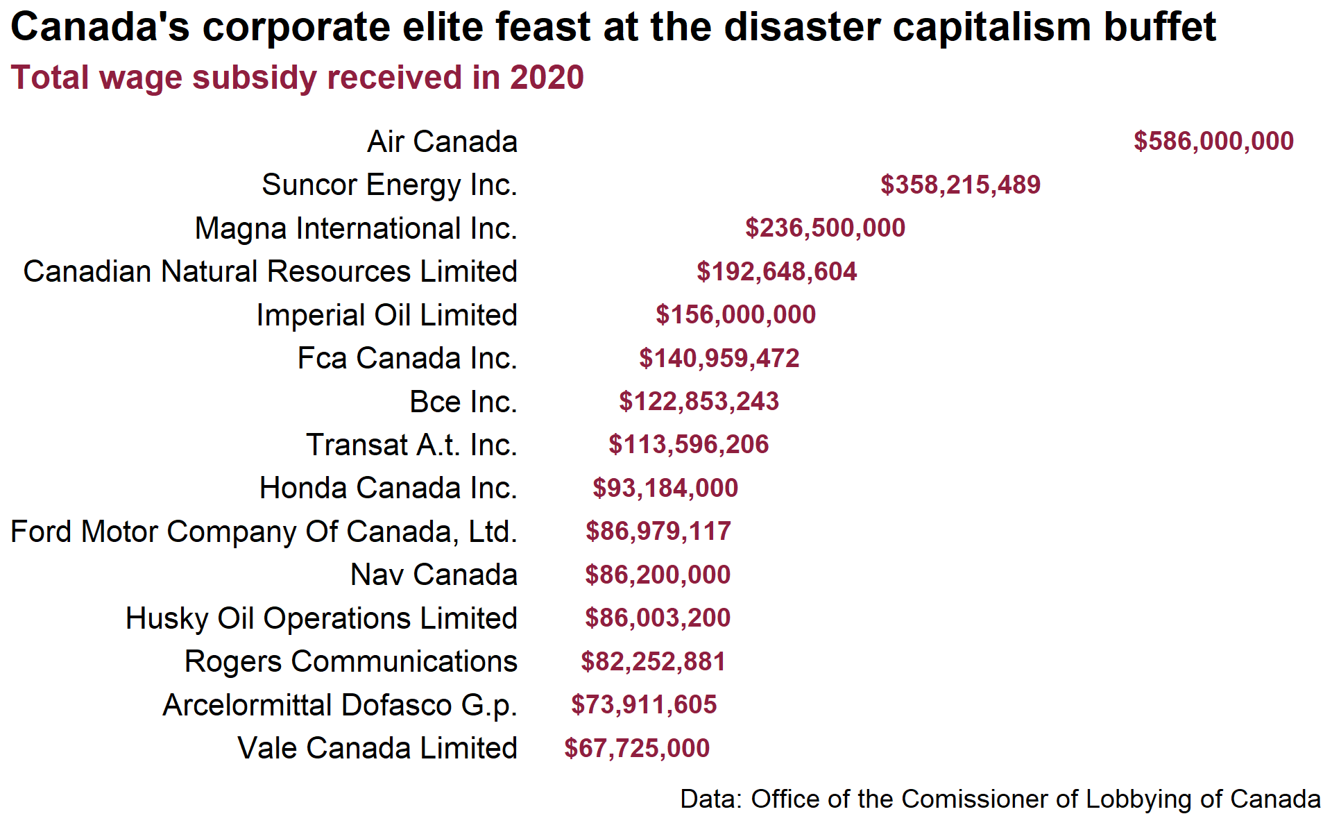
cews_textbar <- cews_data$lobby %>%
  ggplot(aes(fct_reorder(corp, subsidy), subsidy)) +
  geom_text(aes(label = scales::dollar(subsidy)),
                size = 5, fontface = 'bold', color = "#8f1f3f") +
  coord_flip() +
  expand_limits(y = c(10^6, 650*10^6)) +
  theme_custom() +
  theme(axis.text.x = element_blank(),
        panel.grid.major = element_blank()) +
  labs(x = NULL, y = NULL, caption = "Data: Office of the Comissioner of Lobbying of Canada")

cews_textbar
Last but not least, one more hot tip on fancy title text and value legends. I like to use a lot of custom text in the titles and subtitles of the charts for the site. When it’s appropriate for the data and visual, I like to forgo using a color legend and instead encode the color scale values directly into the title or subtitle of the chart.
This is possible with the wonderful ggtext package, which greatly improves text rendering support for ggplot. Using element_markdown, it’s possible to include both markdown and html in plot text.
cews_textbar +
  theme(
    plot.title = element_markdown(
      size = 22,
      hjust = 0,
      face = 'bold',
      margin = margin(b = 8)
    ),
    plot.subtitle = element_markdown(
      size = 18,
      hjust = 0,
      margin = margin(b = 10)
    ),

    plot.title.position = 'plot'
  ) +
  ggtitle(label = "Canada's corporate elite feast at the disaster capitalism buffet",
          subtitle = "<span style = 'color:#8f1f3f;'>**Total wage subsidy received in 2020**</span>")